Okaya AI UX Design

Driving Trust and Adoption in AI-Powered Mental Wellbeing

Company
Role

Lead UX Designer

Work

UX strategy, full redesign, responsive design, vision

AI UX Strategy & Design

Year

2024 - 2025

Background

Okaya is a mental health platform using generative AI and machine learning to help people understand and improve their wellbeing. At its core is Sanora, an AI assistant that conducts private check-ins - analyzing audio, video, and language patterns to surface insights, detect fatigue, and track emotional trends over time.

Their clients include high-stress organizations like the Air Force, Space Force, fire departments, and university systems.

Background

Okaya is a mental health platform using generative AI and machine learning to help people understand and improve their wellbeing.

At its core is Sanora, an AI assistant that conducts private check-ins - analyzing audio, video, and language patterns to surface insights, detect fatigue, and track emotional trends over time.

Their clients include high-stress organizations like the Air Force, Space Force, fire departments, and university systems.

The Challenge

Okaya had strong tech and early traction, but the experience wasn't launch-ready. Users didn’t trust it. Check-ins felt awkward. There were gaps in the AI logic that left people unsure how to interpret or act on insights.

Without clarity and emotional intelligence, adoption stalled. Scaling wasn’t an option until the UX earned trust.

The Challenge

Okaya had strong tech and early traction, but the experience wasn't launch-ready.

Users didn’t trust it. Check-ins felt awkward. There were gaps in the AI logic that left people unsure how to interpret or act on insights.

Without clarity and emotional intelligence, adoption stalled. Scaling wasn’t an option until the UX earned trust.

My Role

I came in as lead UX designer with one job: make this product something people actually want to use.

In just 8 weeks, I rebuilt the product end-to-end: research, UX strategy, UI redesign, scalable system design, and product vision. For both desktop and mobile.

This work laid the foundation for growth, helped secure pilot buy-in, and positioned Okaya to scale with confidence.

TL;DR

I led a full UX overhaul for Okaya, an AI-powered mental health platform used by high-stress teams like the Air Force and fire departments. We focused on building clarity, emotional trust, and explainability into the product - especially around AI interactions.

The redesign included user research, wireframes, rebranding, and end-to-end UI work across mobile and desktop. It earned a System Usability Scale (SUS) score of 85, showing strong ease-of-use and user confidence.

Feedback from users and potential customers was very positive. One user said, “I felt immediately at ease to be open. [Even though] it’s AI, I felt zero judgment... I even got emotional.”

Impact:
The new design helped Okaya secure successful demos at MassChallenge, Esri, and Space Force innovation events, and played a key role in closing pilot deals with enterprise customers. Internally, the team now has a flexible system to build on without starting over every time.

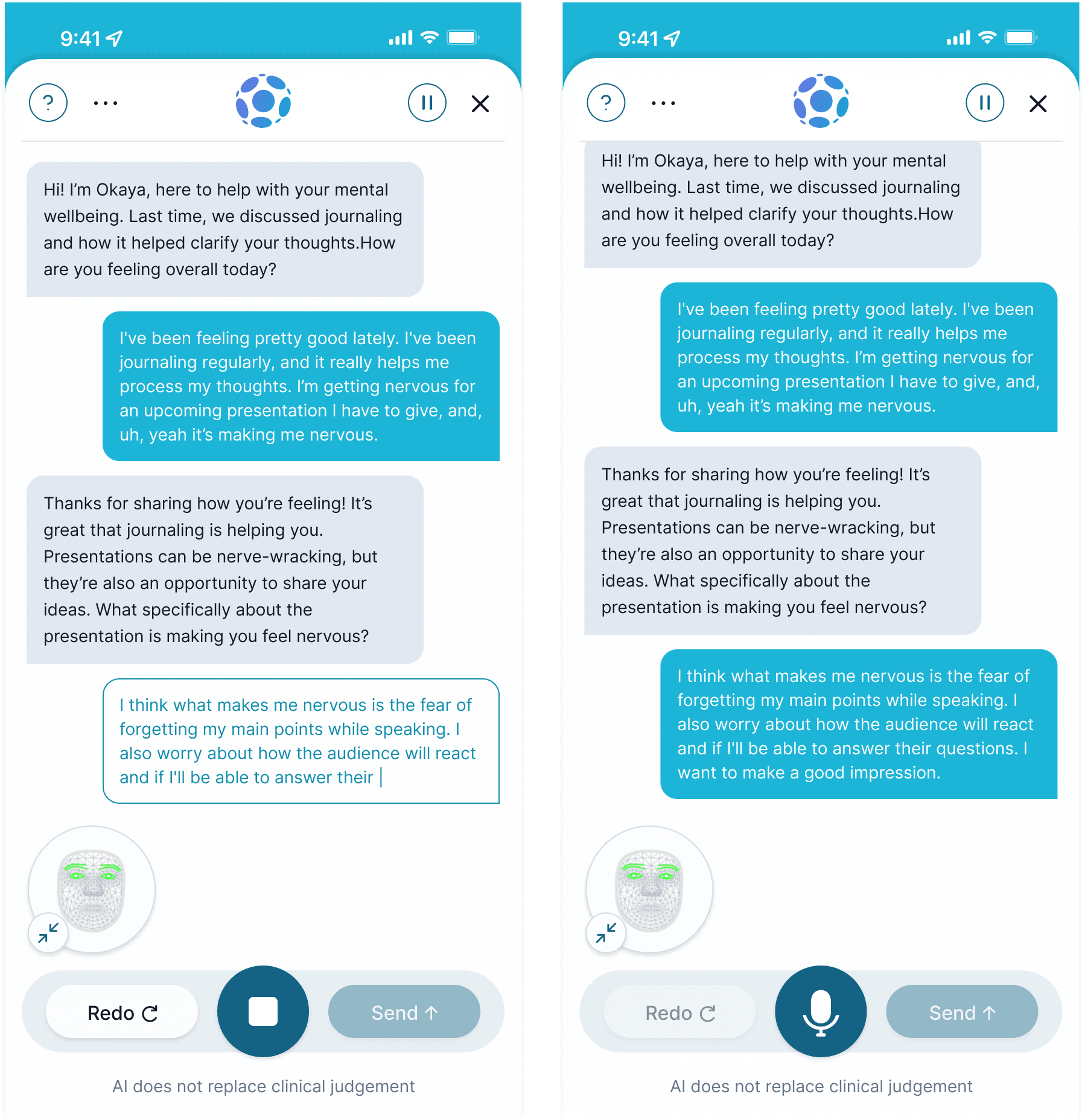
Meet Sanora: The AI Companion Behind the Check-In

Sanora is Okaya’s AI wellbeing assistant. During a check-in, she analyzes voice, tone, facial movement, and speech to generate a real-time wellbeing score.

Sanora is Okaya’s AI wellbeing assistant. During a check-in, she analyzes voice, tone, facial movement, and speech to generate a real-time wellbeing score.

That sounds really cool - but the original experience made her feel a bit cold, robotic, and borderline dystopian.

I reframed her tone, language, and visuals to feel emotionally supportive. Human enough to trust, without pretending to be a therapist. The goal: help users feel safe, supported, and actually understand what her insights mean.

Researching Real User Behavior First

I started with a discovery sprint to figure out what was really going on. We weren’t just designing a new UI. We were designing for high-pressure mental states and deeply sensitive interactions. And the only way to get this right was to talk to real users about their real needs and translate that into design strategy.

Research methods used

User interviews gave me insight into real workflows, expectations, and pain points - from pilots to clinicians.

Desk research helped me understand the broader mental health and AI trust landscape.

Usability testing of the original app showed breakdowns in flow, unclear scoring, and UI inconsistency.

Personas and journey mapping clarified user goals and surfaced edge cases.

Heuristic audit exposed usability issues, navigation gaps, and missing trust signals.

Opportunity mapping helped me shape both the MVP and our long-term vision.

What We Learned

Research and testing helped us see what users really needed - not just a better UI, but a more trustworthy, easier-to-use experience that fit their mental state and daily routines. These insights shaped how we approached every part of the redesign.

End user needs

(e.g., pilots, firefighters, patients):

  • Needed a smoother, more guided check-in with Sanora (something that felt clear and easy to follow).

  • Wanted better explanations for their scores - what they meant, where they came from, and what to do with them.

  • Asked for more visibility and control around what data was collected and how it was used.

  • Needed the experience to feel calm and supportive, not cold or clinical.

  • Valued long-term insights, but only if they were simple and quick to explore.

  • Expected the product to work efficiently without requiring too much effort or focus.

Admin user needs

(e.g., leadership, wellness officers):

Admin user needs

(e.g., leadership, wellness officers):

Admin user needs

(e.g., leadership, wellness officers):

  • Needed a quick read on team wellbeing - not just data dumps, but patterns that stood out.

  • Wanted clearer guidance on what to do when something looked off.

  • Needed to respect user privacy while still seeing the bigger picture.

  • Asked for the dashboard to feel consistent with the rest of the app so it didn’t feel like two separate tools.

These takeaways grounded the design in real-world use and led us to define key opportunities in the MVP.

Key Design Opportunities

Research surfaced 6 core opportunities to solve:

Make Sanora feel more human.

Focusing on her tone, visuals, and flow.

Explain AI outputs clearly.

Especially scoring and trends.

Build transparency into privacy.

It shouldn't be just a legal checkbox.

Simplify every interaction.

Fast, clear, and low-pressure.

Tailor to emotional context.

We need to adapt to different mental states

Make insights valuable over time.

Build long-term trends with clarity.

Wireframing the New Experience

I started with lo-fi wireframes to explore how the product could support real-world users under pressure. This was a scrappy and iterative process driven by constant feedback.

Wireframing the New Experience

I started with lo-fi wireframes to explore how the product could support real-world users under pressure. This was a scrappy and iterative process driven by constant feedback.

📝 Note: This is scrollabe. More flows are available - happy to walk through them on a call.

Note: Original dev on top. Scroll to see more ➡️

High-Fidelity Design

Once the structure was solid, I jumped into high-fidelity design, starting with a light rebrand.

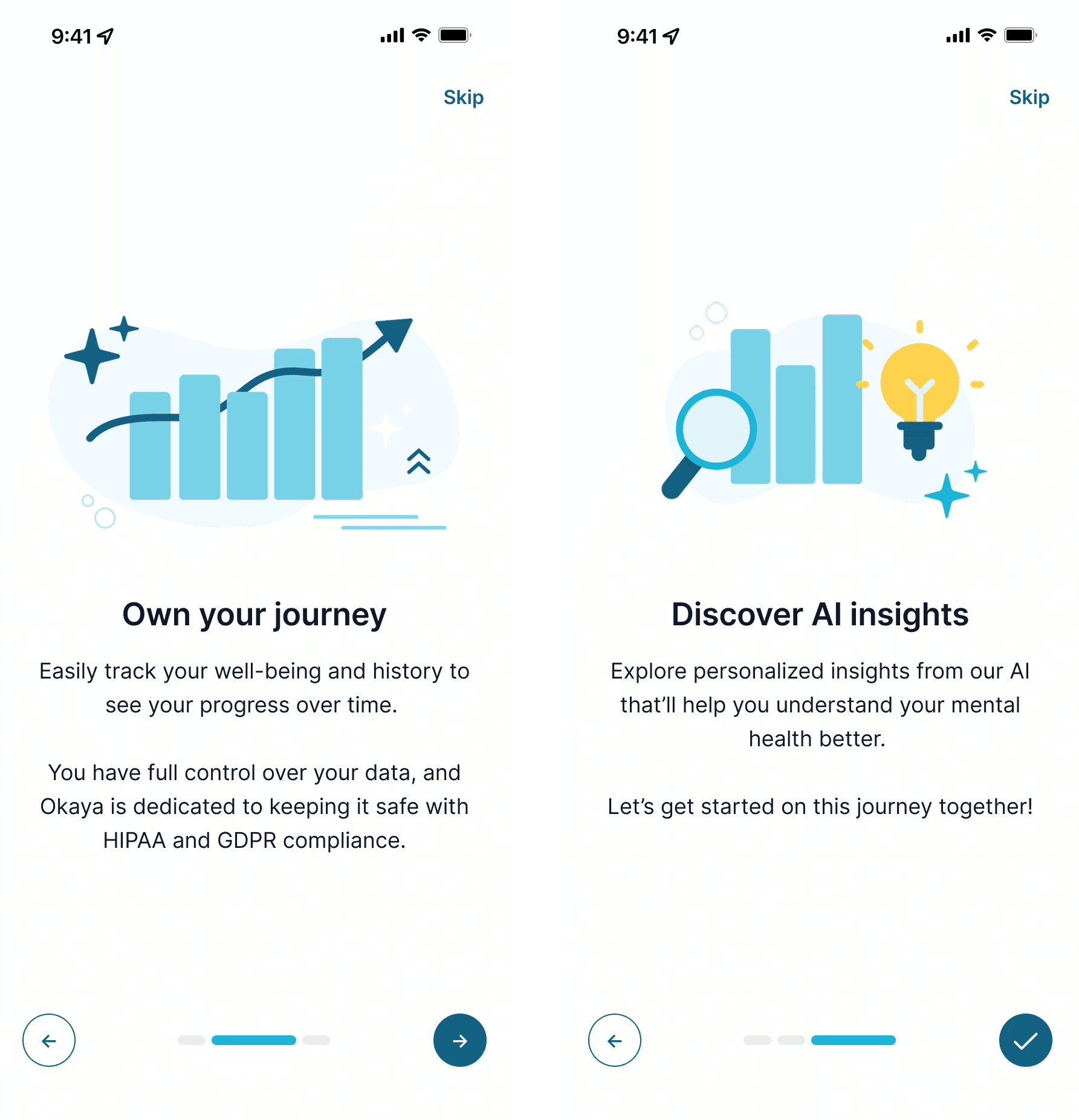
Visual Identity (Brand) Refresh

Okaya’s old brand felt a little stiff and disconnected from the kind of experience we were trying to create.

I tested a handful of styles with users. The one we picked was described as "clear, calm, and supportive." It instantly made the product feel more approachable - even before interacting with it.

Sign Up Flow (With AI Support)

Before users even create an account, they can chat with Sanora to learn how the product works. This reduces early friction and answers questions about privacy, data, and expectations upfront.

It’s a small change, but it helped users feel more informed and in control - and ultimately, more willing to sign up.

Onboarding (Intro to Okaya and Sanora)ded:

I rethought onboarding to feel less overwhelming and more personal. Right from the start, Sanora is introduced as a supportive guide, not just a data collector.

The flow is intentionally short and simple, with light language and imagery. After this, users move into a soft landing experience where Sanora is introduced more conversationally - helping them ease into their first check-in.

Onboarding Flow

I rethought onboarding to feel less overwhelming and more personal. Right from the start, Sanora is introduced as a supportive guide, not just a data collector.

The flow is intentionally short and simple, with light language and imagery. After this, users move into a soft landing experience where Sanora is introduced more conversationally - helping them ease into their first check-in.

Dashboard

The dashboard is designed to stay out of the way and let users focus on what matters most to them: tracking their well-being and understanding their data.

We prioritized clean visuals, quick access to important insights, and built-in explanations, so people don’t have to guess what their scores mean. Especially under stress, the UI should feel like a calm assistant, not another system to manage.

Dashboard

The dashboard is designed to stay out of the way and let users focus on what matters most to them: tracking their well-being and understanding their data.

I prioritized clean visuals, quick access to important insights, and built-in explanations, so people don’t have to guess what their scores mean. Especially under stress, the UI should feel like a calm assistant, not another system to manage.

Pre Check-in Configuration

The original setup flow confused users with too much text, unclear expectations. We replaced it with a fast, step-by-step checklist and a simple message from Sanora to set the tone.

Now it’s clearer, quicker, and helps users feel ready without adding pressure.

Check-In with Sanora (AI Conversation Flow)

This is the heart of the product. The check-in conversation had to feel natural and emotionally intelligent, especially for stressed users.

I redesigned it to feel more like a real conversation - clear back-and-forth, supportive prompts, and flexible edge-case handling. Sanora adapts based on tone, timing, and user responses.

Clinicians we tested this with loved the approach, saying it helped users “tact” internal emotions and ease into difficult conversations.
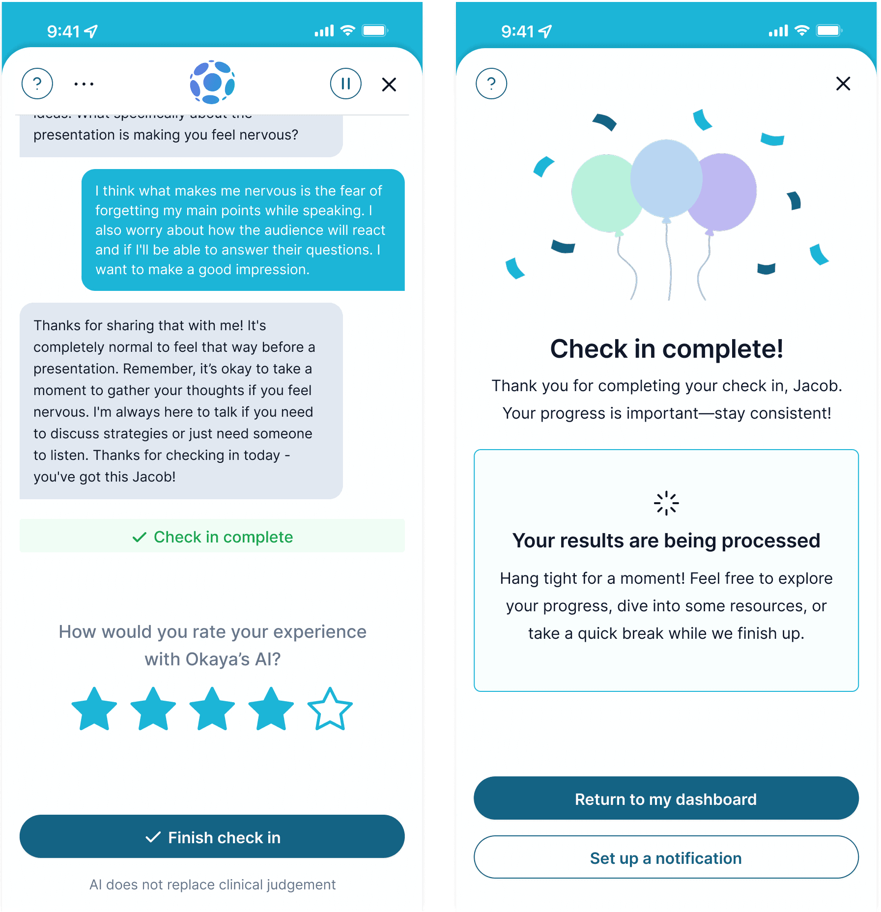
Check-in Details

This screen breaks down what Sanora picked up (key emotions, patterns, and scores). Users wanted clarity, so I embedded plain-language explanations wherever it mattered.

It’s all about turning raw AI insights into something users actually understand and can act on.

History

Users wanted to see the big picture of their mental wellbeing. This view helps them see trends, patterns, and emotional progress over time.

It’s fast to scan, but deep enough to explore, so users feel like they own their journey.

Account Settings

I designed a centralized hub so users could easily manage their preferences and choose how Sanora supports them. No more digging through menus.

Personalization and transparency were key themes - this gives people control without creating extra cognitive load.

Admin Dashboard

For leadership teams, we built a high-level dashboard that surfaces team wellness without overwhelming them or violating privacy.

It shows burnout risk, cohesion trends, and readiness scores - all prioritized and tied to actions. Designed for decisions under pressure, not just dashboards for the sake of dashboards.

Explainable AI

Users didn’t just need results - they needed to know how and why Sanora gave those results. I focused heavily on AI explainability, using progressive disclosure to keep things simple up front and detailed when needed.

Clear, human language helped reduce confusion, build trust, and make the system feel less robotic.

Data Control and Privacy

Trust starts with control. Users can choose what to share, with whom, and when after every check-in.

We made privacy settings clear, optional, and easy to change. This level of transparency made people more comfortable using the product over time.

Other Cool Stuff

Outside the core redesign, I spent time exploring how Sanora and the overall experience could grow. That meant thinking through new touchpoints like in-app education, deeper insights, and more ways to bring personality and support into the product.

I also helped shape Okaya’s presence beyond the app, from web design, illustration, slide deck design, and product docs. The goal was to make sure everything - from customer pitches to user flows - felt clear, consistent, and aligned with where the product was heading.

High-Fidelity Design

Once the structure was solid, I jumped into high-fidelity design, starting with a light rebrand.

Test and Refine

With the core experience in place, we moved into testing. I ran usability sessions and feedback calls with real users - including pilots, clinicians, and org leaders - to stress test the product in real-world mental states and workflows.


The updated experience earned a System Usability Scale (SUS) score of 85, show strong ease-of-use and trust. Here's what we heard from our users:

“I felt immediately at ease to be open. [Even though] it’s AI, I felt zero judgment... I even got emotional.”

“I did my first check-in and I love the dialog progress. It was really natural.”

“The UI was satisfying and there’s an inherent wanting to know more about yourself and seeing that data.”

“I think it’s laid out very well—I can get help if I need help.”

“If I did this more often, it would really get a feel for what would be helpful for me.”

"I really love the new UI. What a transformation - wow!"

This feedback drove final refinements and helped shape the long-term roadmap.

Impact

The redesign helped Okaya demo successfully at MassChallenge, Esri, and Space Force innovation events, and and played a direct role in helping close pilot deals with enterprise customers.


Internally, it gave the team a reusable system that made future updates faster and easier. For users, the product now feels calm, confident, and worth coming back to.

Lessons Learned

People don’t trust what they don’t understand. AI explainability isn’t optional.

Tone matters a lot Feeling calm and supported was a strong UX.

Insights are only useful if they show up at the right time and in the right way.

What's Next

Sanora’s getting smarter - a more natural tone, better adaptability, deeper support for new user types. The admin tools are also evolving to catch patterns earlier and help teams act faster.


We're building for the long game: more personalization, more support, and fewer barriers to care.

Lessons Learned

People don’t trust what they don’t understand. AI explainability isn’t optional.

Tone matters a lot Feeling calm and supported was a strong UX.

Insights are only useful if they show up at the right time and in the right way.

Impact

The redesign helped Okaya demo successfully at MassChallenge, Esri, and Space Force innovation events, and and played a direct role in helping close pilot deals with enterprise customers.


Internally, it gave the team a reusable system that made future updates faster and easier. For users, the product now feels calm, confident, and worth coming back to.

Test and Refine

With the core experience in place, we moved into testing. I ran usability sessions and feedback calls with real users - including pilots, clinicians, and org leaders - to stress test the product in real-world mental states and workflows.


The updated experience earned a System Usability Scale (SUS) score of 85, show strong ease-of-use and trust. Here's what we heard from our users:

“I felt immediately at ease to be open. [Even though] it’s AI, I felt zero judgment... I even got emotional.”

“I did my first check-in and I love the dialog progress. It was really natural.”

“The UI was satisfying and there’s an inherent wanting to know more about yourself and seeing that data.”

“I think it’s laid out very well—I can get help if I need help.”

“If I did this more often, it would really get a feel for what would be helpful for me.”

This feedback drove final refinements and helped shape the long-term roadmap.

What's Next

Sanora’s getting smarter - a more natural tone, better adaptability, deeper support for new user types. The admin tools are also evolving to catch patterns earlier and help teams act faster.


We're building for the long game: more personalization, more support, and fewer barriers to care.

Researching Real User Behavior First

I started with a discovery sprint to figure out what was really going on. We weren’t just designing a new UI. We were designing for high-pressure mental states and deeply sensitive interactions.

And the only way to get this right was to talk to real users about their real needs and translate that into design strategy.

Research methods used

User interviews gave me insight into real workflows, expectations, and pain points - from pilots to clinicians.

Desk research helped me understand the broader mental health and AI trust landscape.

Usability testing of the original app showed breakdowns in flow, unclear scoring, and UI inconsistency.

Personas and journey mapping clarified user goals and surfaced edge cases.

Heuristic evaluation exposed usability issues, navigation gaps, and missing trust signals.

Opportunity mapping helped me shape both the MVP and our long-term vision.

What We Learned

Research and testing helped us see what users really needed - not just a better UI, but a more trustworthy, easier-to-use experience that fit their mental state and daily routines.

These insights shaped how we approached every part of the redesign.

End user needs

(e.g., pilots, firefighters, patients):

  • Needed a smoother, more guided check-in with Sanora (something that felt clear and easy to follow).

  • Wanted better explanations for their scores - what they meant, where they came from, and what to do with them.

  • Asked for more visibility and control around what data was collected and how it was used.

  • Needed the experience to feel calm and supportive, not cold or clinical.

  • Valued long-term insights, but only if they were simple and quick to explore.

  • Expected the product to work efficiently without requiring too much effort or focus.

Admin user needs

(e.g., leadership, wellness officers):

  • High-level insight, not just data. Admins needed quick access to trends and risks, without digging.

  • Guidance for action. It wasn’t enough to surface insights - they needed guidance knowing when and how to respond.

  • Trusted boundaries. Insight had to respect user privacy (oversight without overreach).

  • Consistency across tools. Admins needed the dashboard to feel as intuitive as the app, with shared patterns and logic.

These takeaways grounded the design in real-world use and led us to define key opportunities in the MVP.

Key Design Opportunities

Research surfaced 6 core opportunities to solve:

Make Sanora feel more human.

Focusing on her tone, visuals, and flow.

Explain AI outputs clearly.

Especially scoring and trends.

Build transparency into privacy.

It shouldn't be just a legal checkbox.

Simplify every interaction.

Fast, clear, and low-pressure.

Tailor to emotional context.

We need to adapt to different mental states

Make insights valuable over time.

Build long-term trends with clarity.

Like What You See?

Like What You See?

Let’s schedule a call to explore how my design can elevate your business.

Let’s schedule a call to explore how my design can elevate your business.